CBP OIT Design System
I have omitted confidential information in this case study. All information in this case study is my own and does not necessarily reflect the views of U.S. Customs and Border Protection (CBP).
Context
The CBP OIT Design System is an internal comprehensive design resource that aims to ensure consistency across all of CBP’s Office of Information Technology (OIT) applications. It is a centralized collection of reusable components, principles, guidance, assets, and other resources that follow a specific look and feel that expands across CBP OIT.
It was started in 2018 but fell behind due to a lack of resources and leadership changes.
My Role
I was on a team of 3 designers, 1 developer, and 1 scrum master. Since joining the project in July of 2020, I’ve supported 2 releases. As of May 2021, the project was put on hold due to funding and priority changes.
My Contributions: I led the USWDS Integration effort (read more under “Our Approach”).
The 3 of us worked together on updating the content and creating the component library together.
The Challenge
How might we update this outdated design system to be consistent with industry best practices and compliant with federal regulations?
How might we increase our team’s efficiency when it came to mockup creation?
1. Our product suite was not entirely cohesive and there was no centralized resource for designers and developers to pull from. Even though a design system existed, it wasn’t widely used.
2. It was outdated - this design system hadn’t been touched in over 2 years with the constant transitioning of resources on this project.
3. Even within our design team, there was no consistency with typography and components such as text fields. Many components had to be copied or pasted in from other files or created from scratch.
Final Product & Impacts
Mockup creation time ↓ 35%
Our component library decreased our mockup creation time by 35% - something that took about an hour because we either had to create from scratch or copy and paste in components from different files and then edit now took around 40 minutes. Our component library can be viewed here.
Impacted over 20 applications
The design system is used across all of the applications in the product suite that my team supports.
Two major releases
The OIT Design system released v1.1 and v1.2 over the course of 8 months
Our Approach
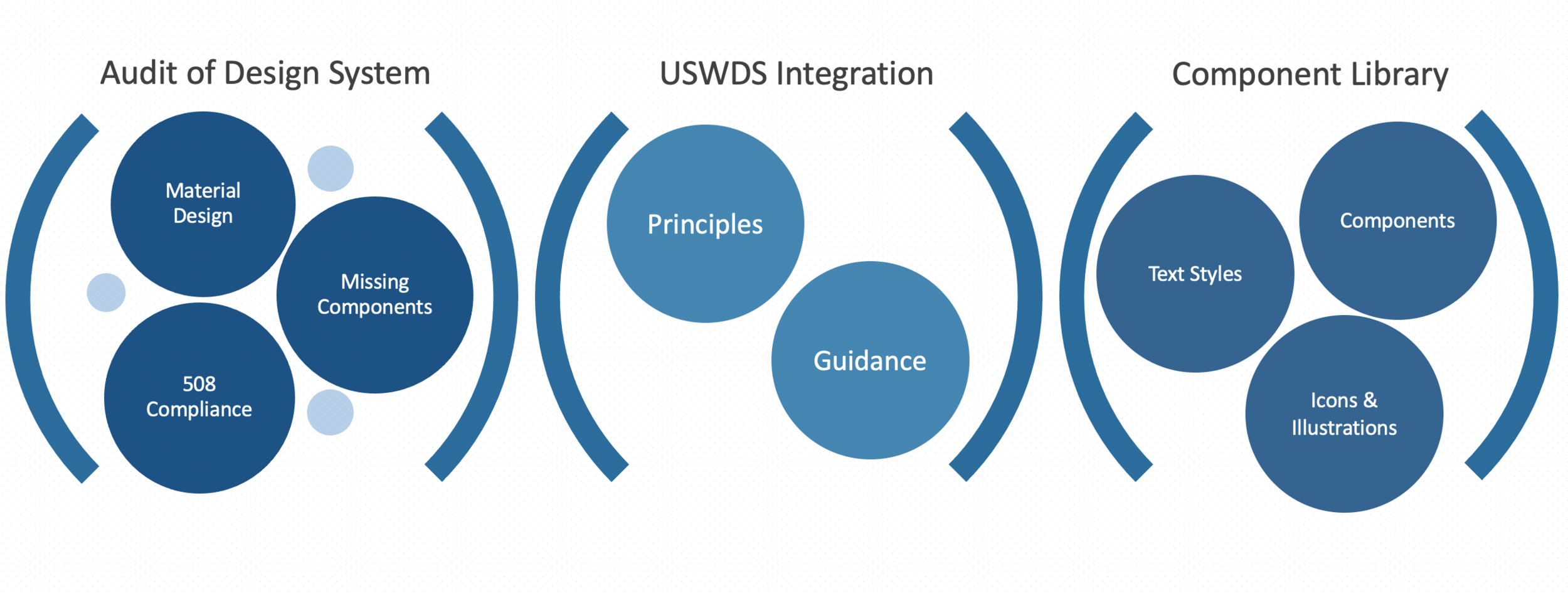
Audit
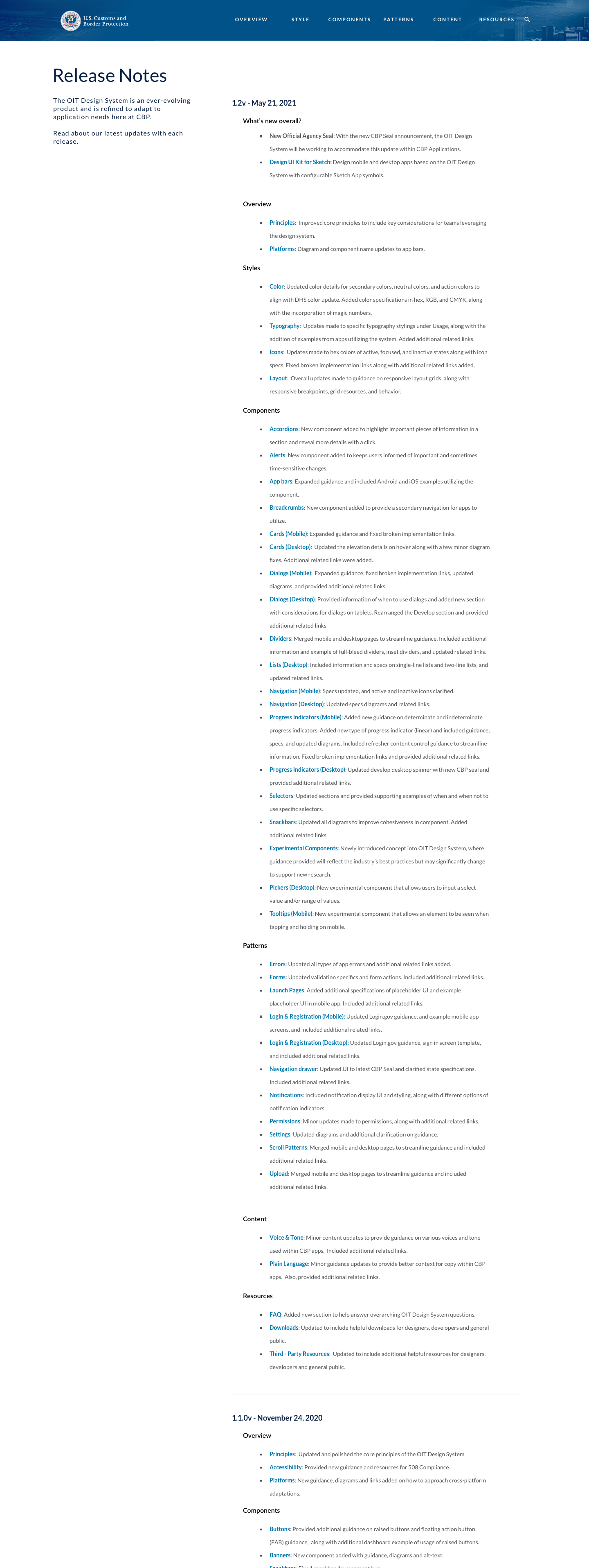
We started off by completing a thorough audit of v1.0. We read through each page and focused on the content and components. We made a note of any misspellings, grammatical errors, unhelpful diagrams, and outdated design conventions. We then reevaluated each component's guidelines and implementation examples. Each finding was turned into a user story to be worked on in our 2 week sprint cycles. Through this process, we released OIT Design System v1.1 and v1.2.
USWDS Integration
In order to be compliant with federal regulations, we reviewed the U.S. Web Design System - the official design system for public federal government for web design. and ensured that our guidance and principles matched with their standards. I led this effort.
The 21st Century Integrated Digital Experience Act (IDEA) requires “any website of an executive agency that is made available to the public after the date of enactment of this Act shall be in compliance with the website standards of the Technology Transformation Services of the General Services Administration.”
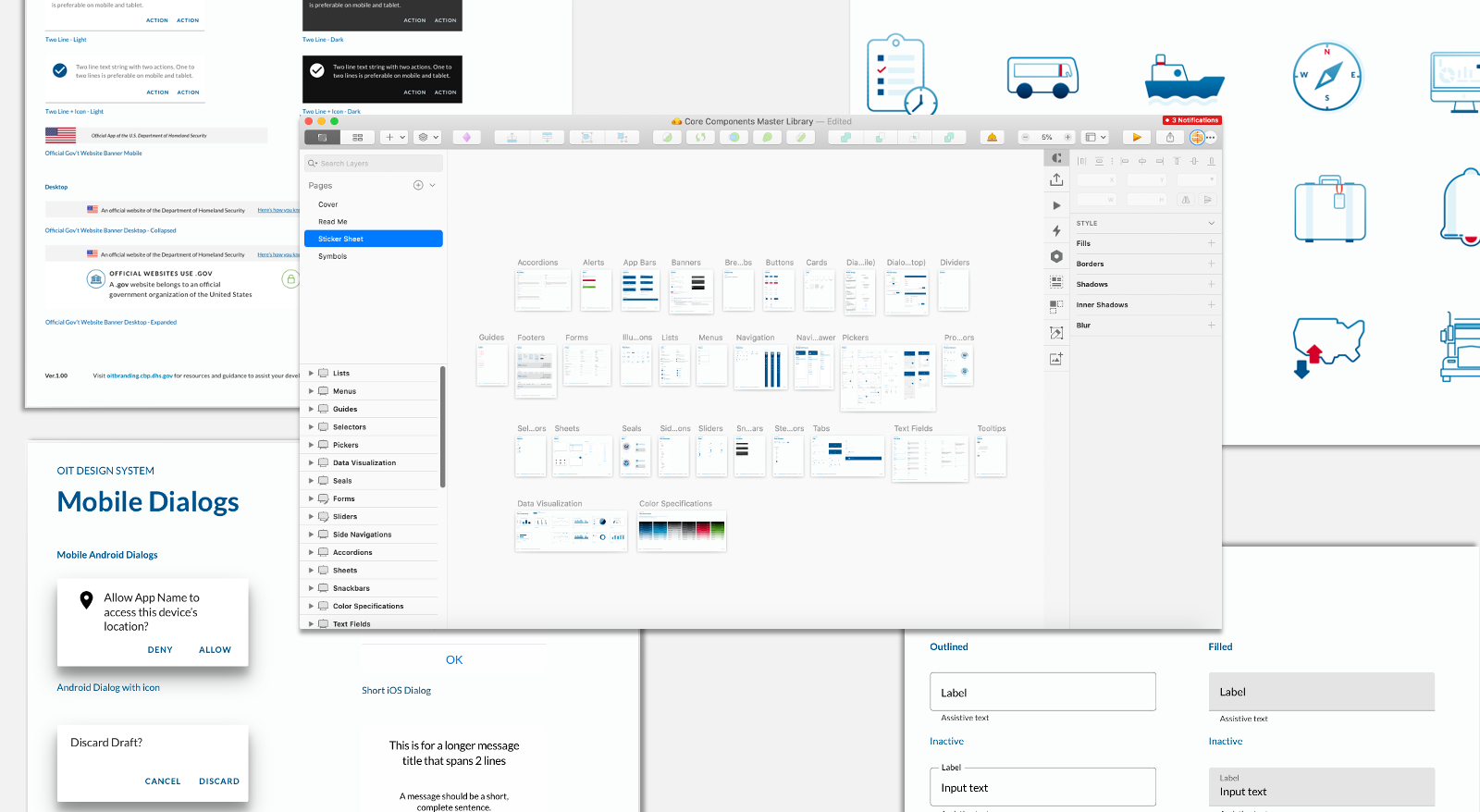
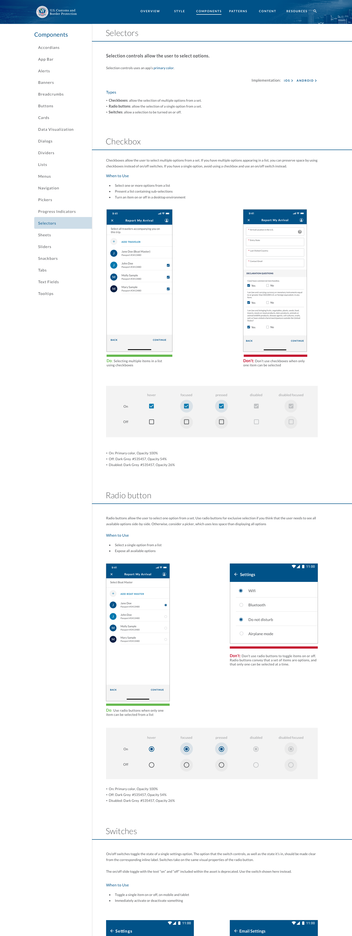
Component Library
As someone that was new to the team, I noticed there was no consistency with things like text fields and typography. The biggest thing that was missing as part of our audit was a component library. Each of us had created our own mini component library but there was no standardization across the team. Based off our initial audit and our USWDS integration efforts, we created a component library in Sketch that housed all of our commonly used components and their states.
I worked on this in conjunction with 2 other designers.
Next Steps
We hope that in the near future, our design system can support not just the office of information technology, but all of CBP’s digital applications. Next on the roadmap is increasing the awareness of 508 compliance on mobile applications and specific core components, as well as potentially introducing design tokens.